Attention all TAF attendees and #TAFHACK participants, the Hackathon results are in! The Hackathon took place on the third and final day of this year’s TAF: Analytics for Insight and Action. #TAFHACK allowed participants to digitally connect and use advanced analytics and data visualization techniques in Spotfire to address real-world problems impacting us today.
What was the 2023 #TAFHACK challenge? To use Spotfire® data visualization to provide a deeper understanding of the long-term impacts, causes, and research surrounding food deserts in Houston, Texas. The results are aimed at providing policymakers with actionable insights to mitigate the problem.
The Hackathon Challenge
With nearly 300 Hackathon sign-ups from around the world, we were extremely impressed with the creativity, insight, and talent showcased throughout this year’s #TAFHACK. Hackers attempted a 24-hour challenge to enable greater awareness of food deserts and to provide insight into how policymakers and public health officials can make data-driven decisions to help mitigate related health and nutritional issues in their communities.
The work hackers completed during this challenge was graded by a panel of industry experts and data visionaries on the following four criteria: innovation, visual storytelling, functionality, and real-world impact.
- Innovation: Does the dashboard demonstrate techniques that push the boundaries of data analysis and drive decision-making for food desert-related problems?
- Visual Storytelling: Are the visualizations easy to understand and provide insights that are not immediately obvious from the data itself?
- Functionality: How are the dashboard’s interactivity, user experience, ease of use, navigation, and performance of different interactive functions?
- Real-world Impact: Will the ideas shown make a difference in the real world, target high-impact problems, and offer viable solutions?
The Hackathon Winners
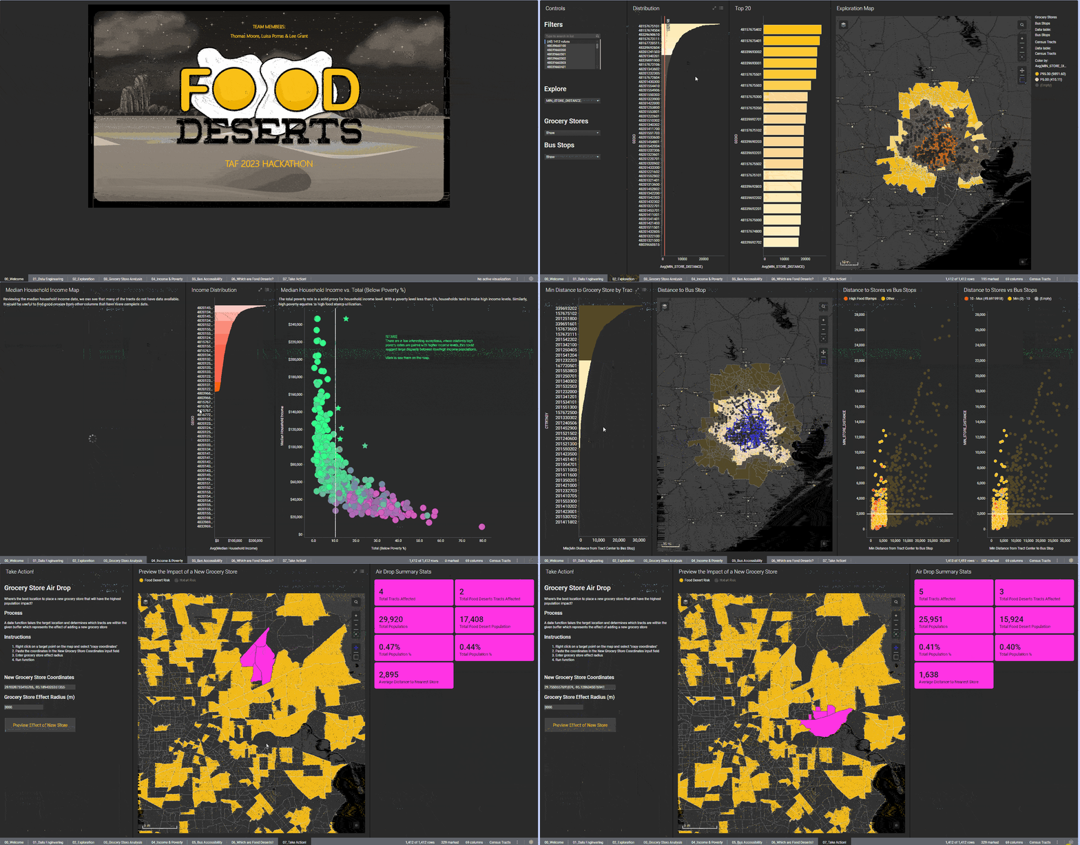
1st Place: Lee Grant, Thomas Moore, and Luisa Porras
Winning 1st place is a team comprised of Lee Grant, Thomas Moore, and Luisa Porras. Panelist feedback on their dashboard included everything from “excellent storytelling” to “nailed the theme of this year’s TAF.” The team left a lasting impression with their detailed, yet clean, analytics and visualizations throughout their entire presentation. By answering all questions posed in the challenge directly and creating a dashboard with high functionality and visual storytelling, they positioned themselves as our overall winner. Check out their feature on our latest Dr. Spotfire live stream.
The presentation states, “There are 1.5 million Houston residents potentially at risk of living in a food desert, nearly 20 percent of affected neighborhoods below the poverty line, and an average distance to a grocery store of 3 miles.” These insights outlined the very need and importance of this challenge—using data to understand the scale and possible solutions of our food desert problem. See an example of this submission below:

2nd Place Tie: Braeden Gilchrist
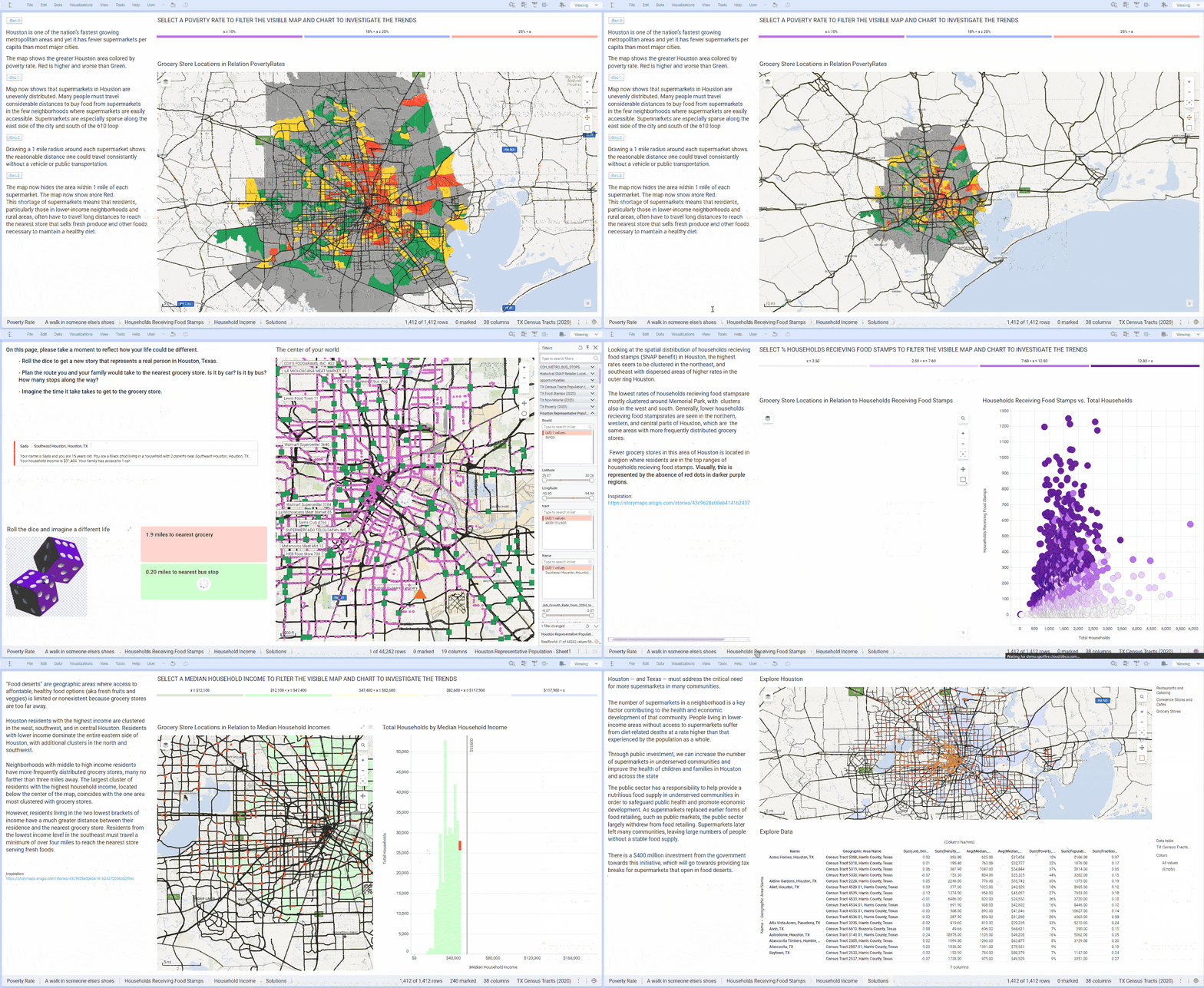
Tied for 2nd place is Braeden Gilchrist. With high marks in the visual storytelling and real-world impact categories, Braeden’s dashboard received panelist remarks such as “the best showcase of real-world impact” and “his ‘roll the dice and imagine a different life’ idea made people want to know more.” By showcasing his creative and engaging work in the format of an immersive game, he earned exceptional feedback as a comprehensive storyteller as well as a spot among the top contenders of the competition.
See an example of Braeden’s innovative work where he took viewers on a journey by placing them in the perspective of the individual user’s hardships and journey to find food below:

2nd Place Tie: Jon Henderson
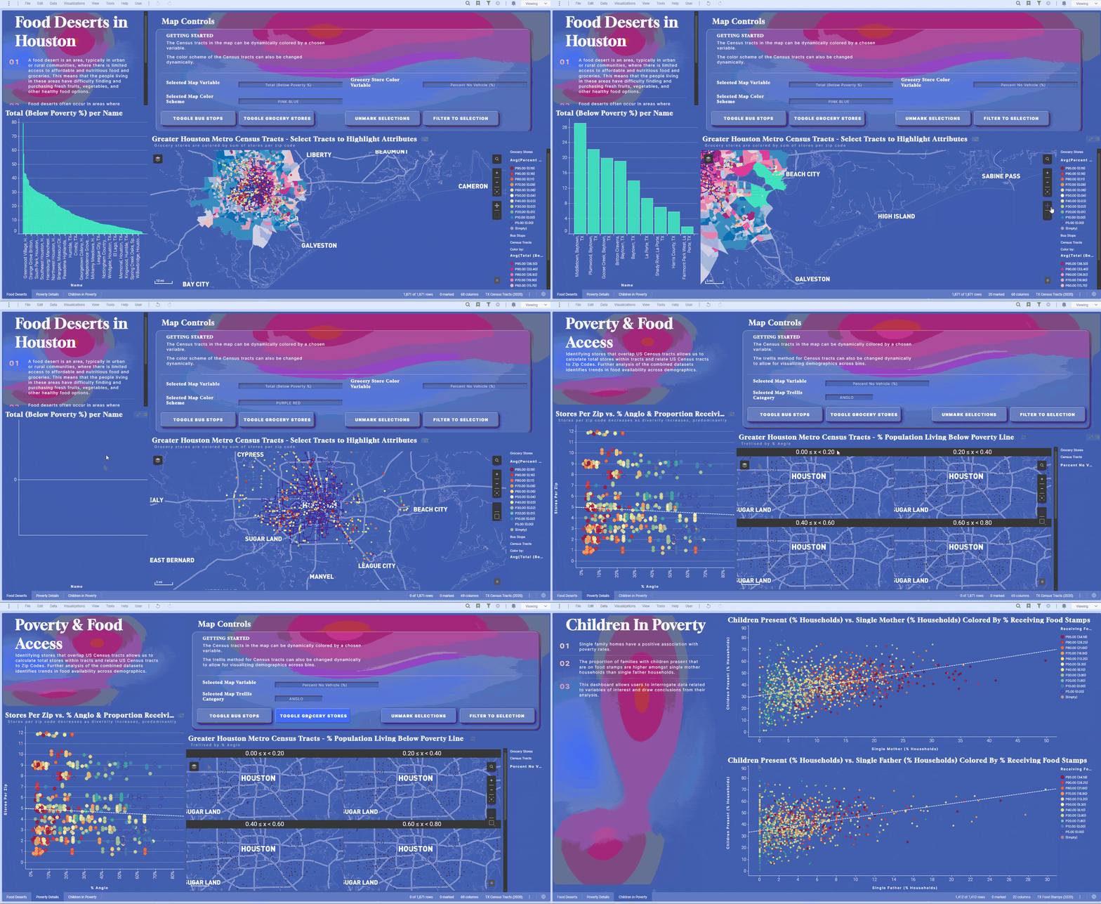
Tied for 2nd place with Braeden is Jon Henderson. By building an eye-catching gradient mesh using CSS customization, Jon left a lasting impression on our panel of industry experts with his attention to detail, storytelling, overall delivery, and theme of his presentation. Receiving positive panelist feedback such as “submission was a great complete story” and “impressive focus on analytics,” Jon created a dashboard that garnered high praise in the visual storytelling and functionality categories.
See an example of Jon’s work below where he presents an in-depth analysis of the correlation between household percentages that have children in poverty to receiving food stamps:

4th Place: Jason Alley
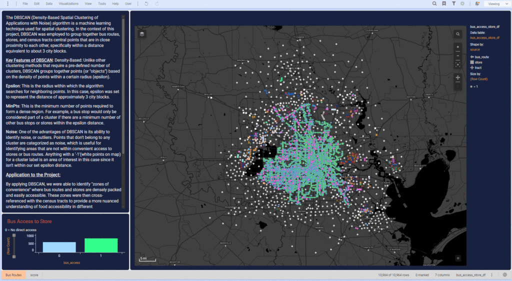
In 4th place, we have Jason Alley. This was Jason’s first time competing in a TAF Hackathon and taking home 4th is quite an accomplishment. Our panel was impressed with Jason’s attention to detail in highlighting food desert areas most in need of intervention. In his work, Jason added a layer of spatial intelligence to his analysis and was able to more accurately identify areas in need of targeted intervention, leaving him with impressive marks in the innovation and real-world impact categories.
See an example of Jason’s forward-thinking analysis of Houston areas in need of intervention in the dashboard below:

The Lasting Impact of TAF Hackathon
Thanks to our participants, we were able to see the connection between data and solving our real-world problems. This challenge highlighted the food desert problem facing so many communities today—without access to healthy food, people can suffer from poor nutrition and associated health challenges that decrease their quality or duration of life. With the demonstrations from hackers, we were able to see the critical importance of providing insight to policymakers so they can make data-driven decisions that mitigate these related issues.
To all of our incredibly talented hackers and panelists from this year’s #TAFHACK, thank you—all participants should feel an immense sense of pride for their work using advanced analytics for social good. Don’t forget to check out the Hackathon feature on our latest Dr. Spotfire live stream.
And don’t worry—if you weren’t able to attend Day 1 or Day 2 of The Analytics Forum, you can view most speaker sessions on-demand until November, 21st, 2023.
