Mods
Low-code custom analytics apps
Spotfire® Mods are innovative “grab and go” custom visualization and analytics apps that leverage the power of Spotfire® for a seamless, fit-for-purpose analytics experience. The Mods cloud-enabled framework makes it easy for anyone to build, share, and use.
Featured mod

Gauge Mod
The gauge mod is a configurable visualization for gauge reading using a radial scale to display a specific data point using a dial over a radial scale with defined limits.
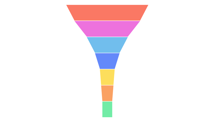
Display values as progressively decreasing proportions amounting to 100 percent in total.
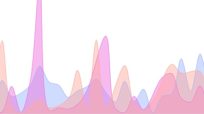
Display the probability density of the data at different values.
Narrate data and visuals instantly and have conversations with your data.
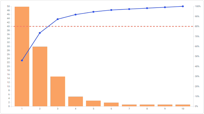
Display and prioritize the frequency or impact of different categories of data.
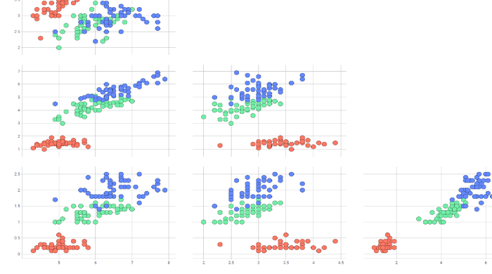
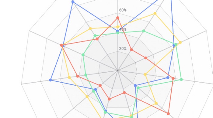
Visually explore the pairwise relationships between multiple variables in a dataset.
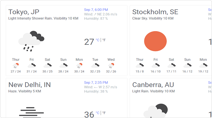
Get live weather information and 7 days forecasts for one or multiple locations.
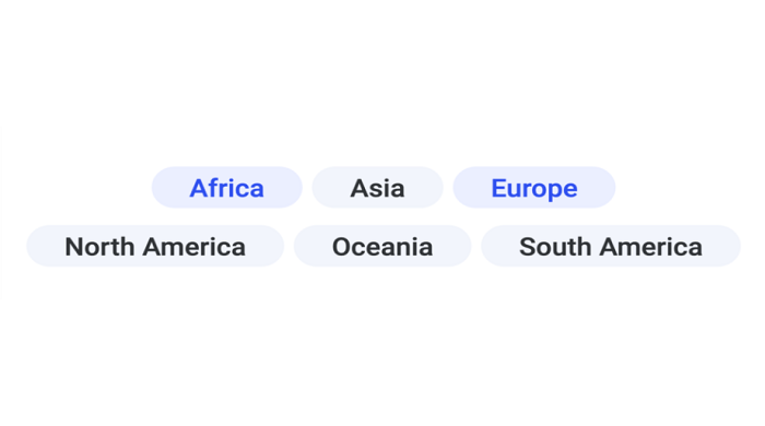
Displays a set of selectable tags that can be used to query a dataset based on keywords.
Visualize three variables in 3-dimensional space.Display a selectable list of unique values in a column or a hierarchy.
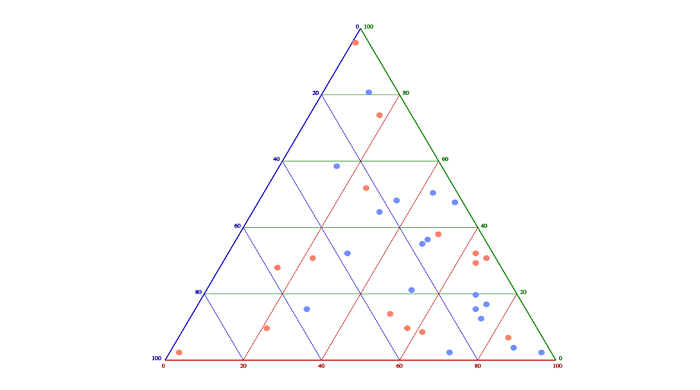
A barycentric plot on three variables to graphically depict ratios of the three variables in an equilateral triangle.It is used in physical chemistry, petrology, mineralogy, metallurgy, and other physical sciences to show the compositions of systems composed of three species.
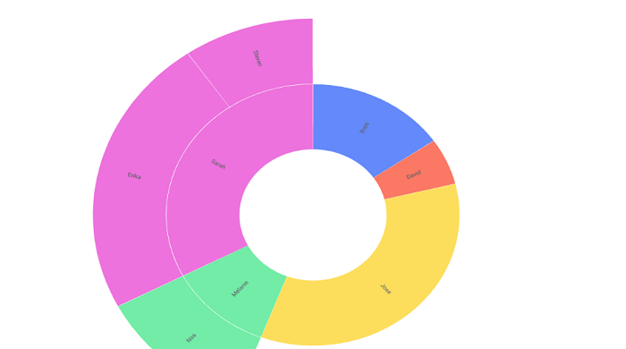
Visualize hierarchical data, depicted by concentric circles with multiple levels of categories showing how the outer rings relate to the inner rings.
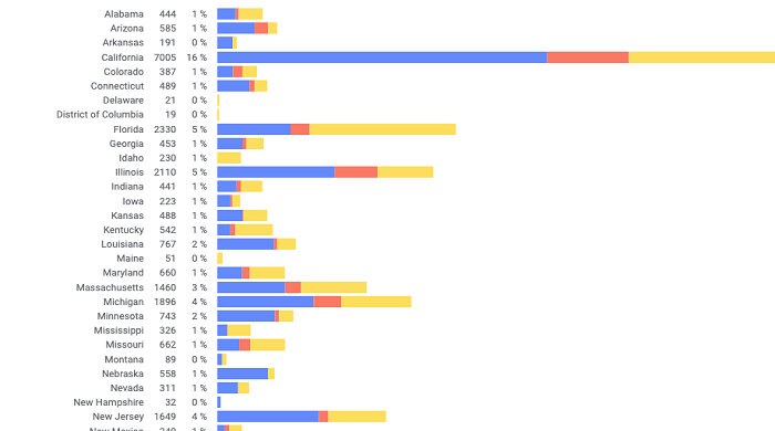
A similar visualization to a usual bar chart, except it adds a scroll bar if more bars needs to be shown instead of decreasing the bars size and labels of the bar are always visible, readable and without ellipsis.
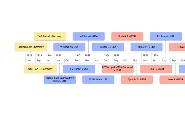
The timeline can be used to show events on a timeline.

A similar visualization to a usual pie chart, except sectors are equal angles and differ rather in how far each sector extends from the center of the circle.
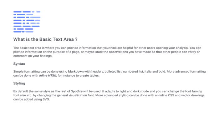
Add basic textual descriptions to dashboards and analyses from the Spotfire Web UI.

This visualization shows a single calculated value sized to fill the whole visualization area.
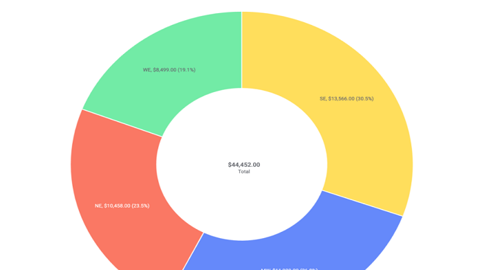
The donut chart is functionally identical to a pie chart, with the exception of a blank center and the ability to support multiple statistics at once. It provides a better data intensity ratio to standard pie charts since the blank center can be used to display additional data.
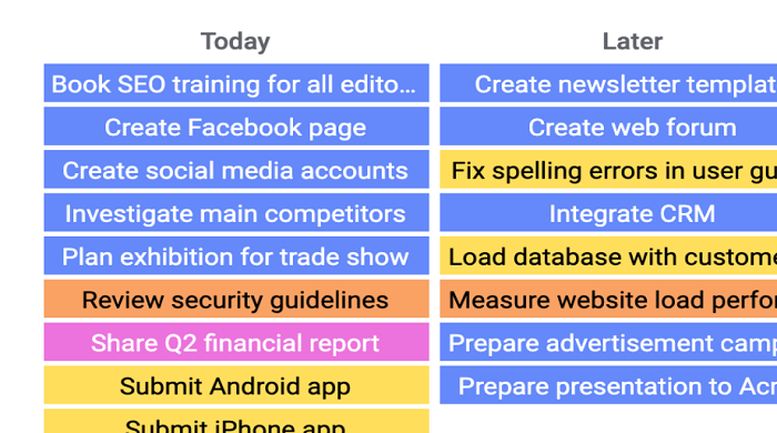
Visualize tasks or items in different stages or categories and depict work at various stages of a process using cards to represent work items and columns to represent each stage of a process.
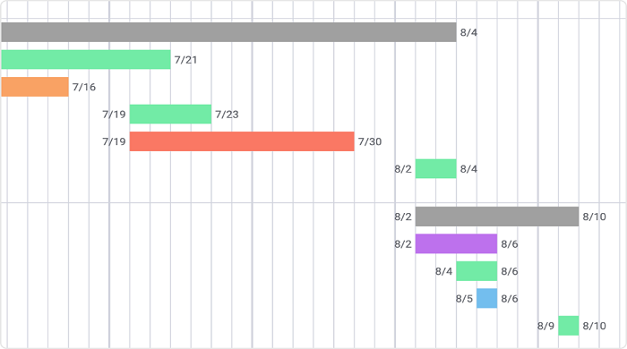
A type of bar chart that visualizes various categories into time series illustrating the start and finish time in time period blocks.
A special form of line chart designed for exploring changes in rank over time. Useful to compare the position / performance / ranking of multiple observations rather than the actual values itself.
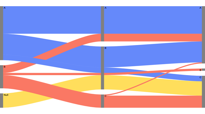
A specific type of flow diagram, in which the width of the arrows is shown proportionally to the flow quantity. They are typically used to visualize energy or material or cost transfers between processes.
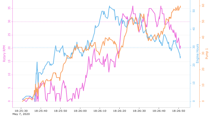
Similar to the Spotfire line chart, this visualization displays information as a series of data points connected by straight line segments with the different that this mod adds ability to shade background over a specific range, adds ability to draw reference lines for a single axis and adds ability to separate, color and individually label Y-axis.
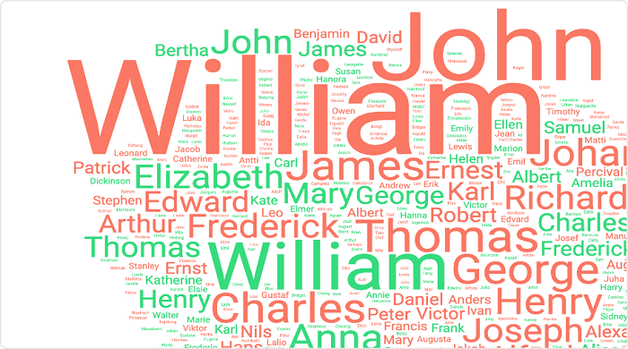
A visual representation for text data typically used to depict keywords and their importance with font size or color. Useful for quickly perceiving the most prominent terms and for locating a term alphabetically to determine its relative prominence.
The quintessential candlestick and OHLC bar stock price chart that anyone who has an online broker has encountered.
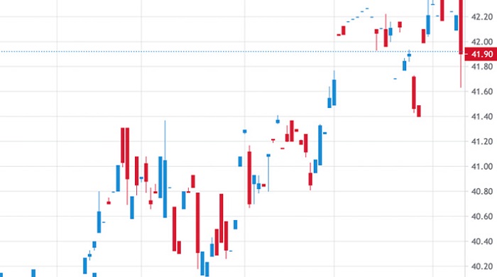
The quintessential candlestick and OHLC bar stock price chart that anyone who has an online broker has encountered.
Text Card Mod displays text from a column as multi-lines cards that can be read more easily than rows in a table.

The Animated Bubble Chart animates values over time by showing movement within a two-dimensional space and changes in the size and color of the bubbles.
Area Chart draws lines with the area below filled with colors to represent the development of quantitative values over a time period.
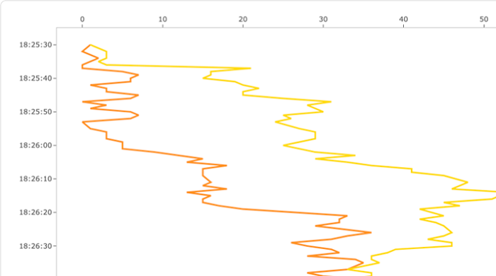
Vertical Line Chart draws charts (scatter, line) to have a vertically oriented axis instead of horizontally oriented axis so that information typically like depth is visualized naturally. You can have multiple lines per chart.
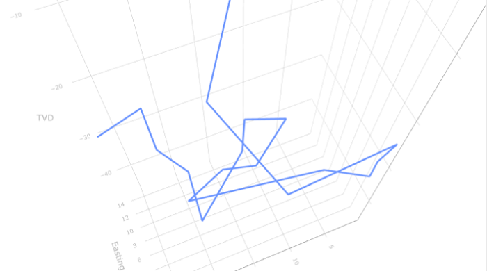
3D Scatter Plot makes an interactive 3D chart that you can use to plot things like well trajectories. It is interactive, you can click and drag it to rotate in 3 dimensions to see the details
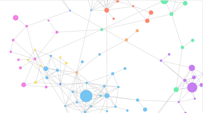
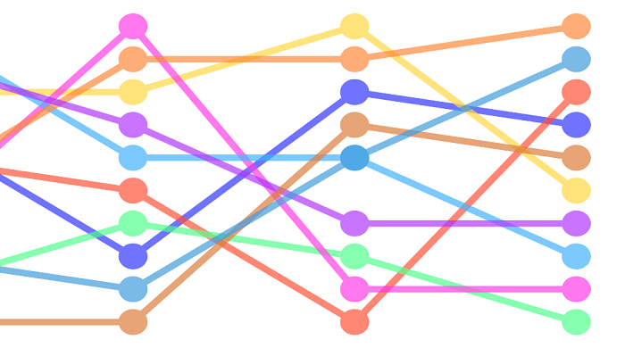
Network Chart Mod adds a new type of visualization to TIBCO Spotfire® that enables visualizing how data is interconnected through the use of nodes and connected lines to represent connections and helps highlight relationships between groups of entities.
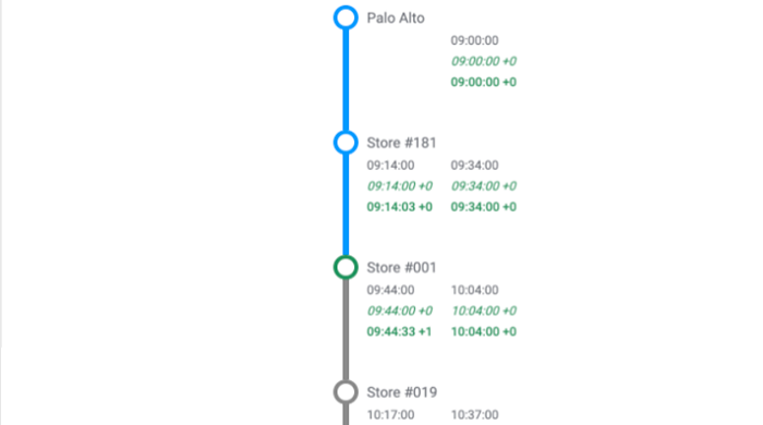
Stop Time Mod adds a new type of visualization to TIBCO Spotfire® that enables displaying a diagram of stops on public transport trips with scheduled and estimated times, and delays.
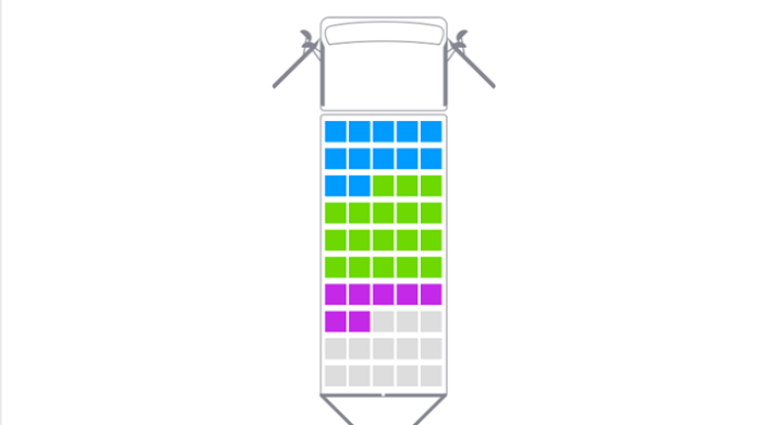
Vehicle Loading Mod is just like a Bar chart but more graphical; showing percentage loading of a vehicle capacity and with the ability to show state of cab or cargo doors open or closed.