Mods
Low-code custom analytics apps
Spotfire® Mods are custom visualization and analytics apps that deliver a seamless, tailored analytics experience. Unique to Spotfire, they harness the full power of the platform, allowing anyone, regardless of technical expertise, to build, share, and utilize powerful analytics tools. Discovering insights has never been easier. Check out Spotfire Mods for the flexibility and functionality you need for a bespoke analytics solution.
Industry-specific visualizations
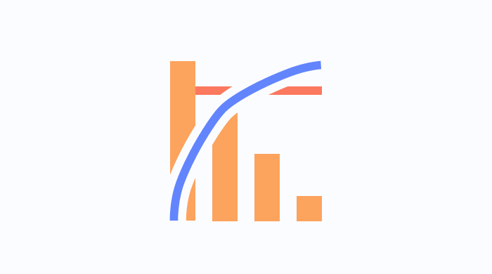
Pareto Chart Mod
Highlight the most significant factors in a dataset, based on the 80/20 rule, identify the underlying causes that create major issues.

Weather Mod
Display real-time weather information, including current conditions and forecasts.

Ternary Plot Mod
Visualize compositional data in a triangular plot, the Mod depicts the ratios of three selected variables as positions in an equilateral triangle for indepth comparison.

3D Combined Surface and Line Chart
Visualize surfaces and lines in one 3D graph to analyze multiple metrics together, compare actual data with forecasted trends.

3D Scatter Plot Mod
Display three variables in a 3D space, reveal patterns and outliers that aren't visible in 2D plots to inform decisions.

Gantt Chart
Manage project timelines by visualizing tasks and categories as a time series, track progress and dependencies to improve decision-making.

Sankey Diagram
Depict flows between different entities or categories, showcase the distribution and movement of resources for further analysis.
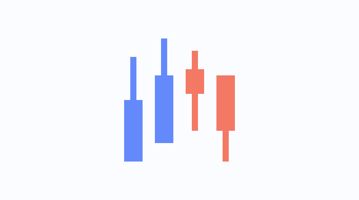
Stock Chart Mod
Track the price movements of financial instruments over time, highlighting trends and changes in market behavior.
Stop Times Mod
Visualize the timing and locations of stops along public transport routes, analyze transit efficiency and schedules.

Vehicle Loading
Illustrate how cargo is loaded and arranged, to aid in optimizing space and logistics in transportation.

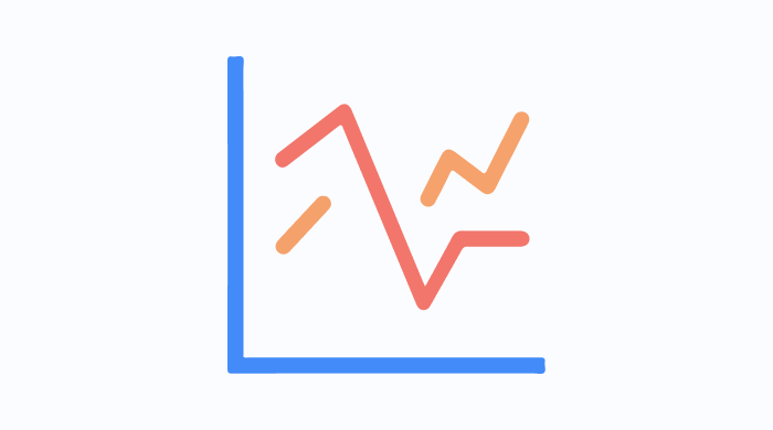
Vertical Line Chart
Present data in scatter or line formats along a vertical axis, to facilitate the comparison across categories.

Well Log Mod
Visualize geological, as well as subsurface data collected from well logs to perform analyses and drive data-driven decision-making in drilling operations.

Well Spacing Diagram
Display the spacing and positioning of horizontal wells within a lateral section, useful for planning and optimizing well layouts for efficient operations.

Wellbore Mod
Represent the structure and path of a wellbore in a two-dimensional view, visualize fluid penetration into a wellbore during completion activities.
Text and value visualizations

Intelligent Narrative Mod
Generate automatic, conversational narratives for data insights, enhance data understanding through contextual storytelling.

Tag Mod
Present a set of selectable tags, and enable analysts and consumers to filter and categorize data easily.
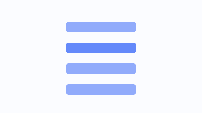
List Mod
Display a selectable list of unique values, quickly filter and explore unique values in a column or a hierarchy.
3D Combined Surface and Line Chart
Visualize surfaces and lines in one 3D graph to analyze multiple metrics together, compare actual data with forecasted trends.
3D Scatter Plot Mod
Display three variables in a 3D space, reveal patterns and outliers that aren't visible in 2D plots to inform decisions.

Basic Text Area Mod
Add rich text descriptions to dashboards for context and narrative, including formatted text and media.

Display Value Mod
Highlight a single key metric or calculated value prominently on your dashboard.
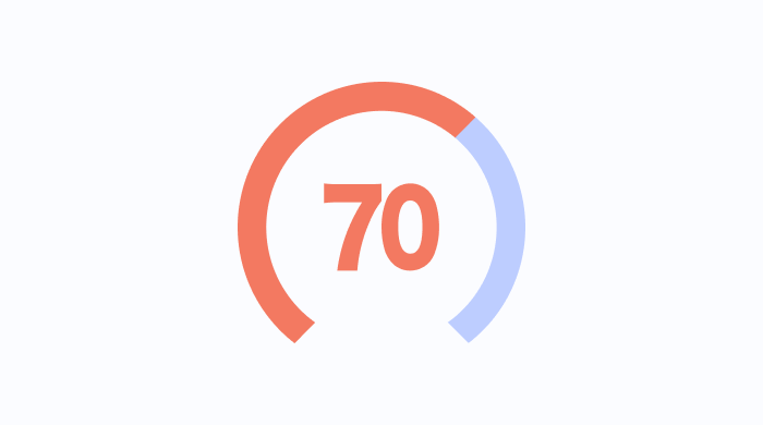
Gauge Mod
Display data using a dial over a radial scale, showcase metrics like speedometers, performance levels, and more.
Horizontal Line Chart
Display scatter plots and line charts with a horizontal orientation, compare data distributions across categories.

Text Card
Display long text entries clearly, and add detailed descriptions or annotations to enhance consumers' understanding of data and visualizations.
Vertical Line Chart
Present data in scatter or line formats along a vertical axis, to facilitate the comparison across categories.

Word Cloud Mod
Depict the most prominent words in a dataset, to highlight their frequency and importance in a visual approach.
Categorical data visualizations

Funnel Chart Mod
Illustrate decreasing values through stages, visualize sales pipelines or process conversions for example.

Violin Plot
Display the distribution of data across different values, enabling the comparison of distributions of sets of data.

Scatter Plot Matrix
Display multiple variables in a grid of scatter plots to explore and compare the relationships between them, and identify correlations, trends, and outliers across different dimensions of your data set.

Circular Bar Chart
Present categorical data in a circular format, a unique alternative to traditional bar charts to enhance your visualizations.
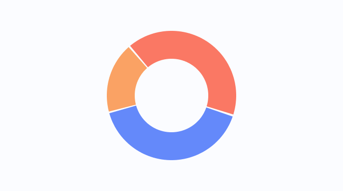
Donut Chart
Visualize proportions of categorical data in a better data intensity ratio than standard pie charts, and display additional data than traditional pie charts.
Horizontal Line Chart
Display scatter plots and line charts with a horizontal orientation, compare data distributions across categories.

Network Chart Mod
Visualize relationships and connections between data points, useful for mapping social networks, as well as dependencies.
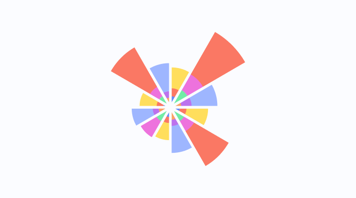
Rose Chart Mod
Visualize cyclic data or phenomena, such as wind directions or periodic trends for example, in a circular format.
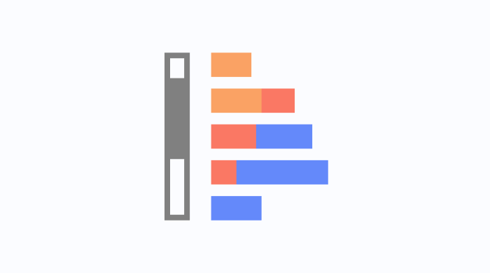
Scrollable Bar Chart
Display categorical data on a horizontal bar chart with a scrollable axis, perfect for viewing large datasets.

Spider Chart
Compare multiple categories across several variables in a single chart, reveal distinct correlations, trade-offs, and a multitude of other comparative measures.

Sunburst Chart
Display hierarchical data with concentric circles, showcase relationships and proportions within complex datasets.
Time-based visualizations

Timeline Mod
Showcase events along a chronological timeline, ideal for visualizing historical data or project milestones.

Kanban Board Mod
Visualize and manage workflows with a Kanban-style board, showcase work stages and progress.

Bump Chart Mod
Track changes in rank over time, ideal for competitive analysis or performance tracking - track the position, performance, as well as the ranking of multiple observations.

Animated Bubble Chart Mod
Animate data points over time within a 2D space, showcase changes and trends dynamically.
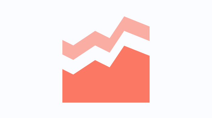
Area Chart Mod
Show quantitative values over time, emphasize cumulative trends with shaded areas.
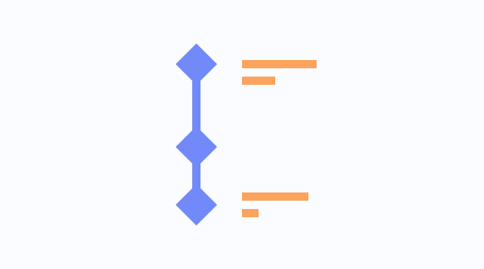
Milestone Diagram Mod
Represent key points in a process flow graphically, highlight important milestones and events, and accurately keep track of processes.
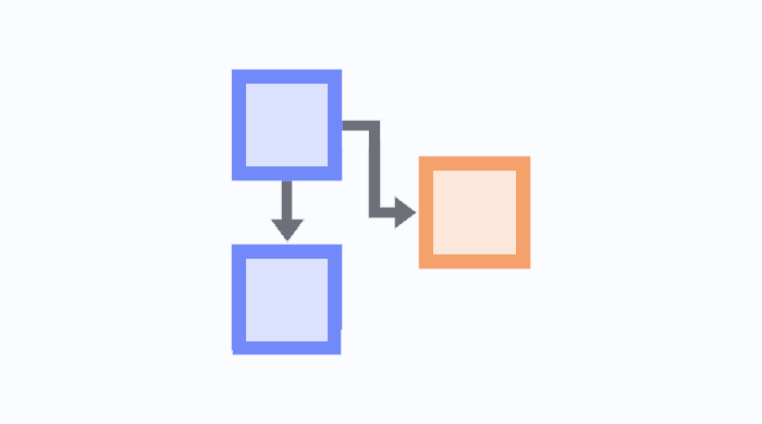
Process Diagram Mod
Illustrate process steps and their dependencies, visualize workflows and identify bottlenecks to help improve operational efficiency.
Process visualizations
Process Diagram Mod
Illustrate process steps and their dependencies, visualize workflows and identify bottlenecks to help improve operational efficiency.
Gantt Chart
Manage project timelines by visualizing tasks and categories as a time series, track progress and dependencies to improve decision-making.
Kanban Board Mod
Visualize and manage workflows with a Kanban-style board, showcase work stages and progress.
Milestone Diagram Mod
Represent key points in a process flow graphically, highlight important milestones and events, and accurately keep track of processes.