What is a combination chart?
A combination chart compares data in a few different categories over a period of time. In general, there are two or three types of charts combined together to show a relationship between data points. Typically, a bar chart and a line chart are used together. However, an area chart or dot chart could be incorporated.
Combination charts are designed to visually highlight differences between sets of data and make it easy to see one set of information presented in relationship with other data.
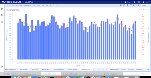
For instance, in the example below, the combination chart uses a bar chart and a line graph together. The bars show the dollar value of electronic goods sales across a chain of American stores. The line shows how many unique customers were present.
The way this chart is presented shows the correlation, if any, between the sales volumes and customer numbers. This allows stakeholders to identify both positive or negative relationships, which can inform decision-making.

This chart, for clarity, has a secondary axis on the right-hand side. This provides more in-depth information and makes it easier to read and understand.
When to use combination charts
Because combination charts are a flexible way of displaying data, they are a useful addition to many reports and presentations. They also are the basis for analytic tools such as the Pareto analysis.
It is ideal to use a combination chart when:
- There are mixed data types (for example, price or volume)
- There is a need to show some kind of relationship or trend between the data types
- The numbers in the data vary widely across data types
- Any outliers need to be identified
- There’s a need to communicate data shape more than the value of categorical data
The pareto analysis and combination charts
A Pareto analysis is a mathematical technique that is used in decision-making. It uses the 80/20 Pareto Principle that 20 percent of the work generates 80 percent of the benefits. This chart helps businesses identify which tasks produce the biggest effects.

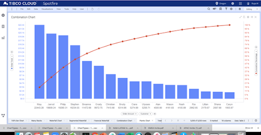
This example shows a Pareto Analysis in action. This particular combination chart shows the salesperson with the largest volume of sales on the left side of the chart. The line element shows the percentage of total sales from the left, at zero, to 100 percent on the right side.
Clearly, this chart shows the Pareto principle in action, with 20 percent of the workforce creating 80 percent of the sales. Tracking the line chart shows a swift escalation on the left, slowly trailing off on the right.
Of course, this does not provide all the information, such as whether some staff members are part-time or which branches they work at, but it does help to maintain quality control for staff.
Types of combination charts
Bar and line combination chart
This horizontal bar graph is combined with a vertical line diagram. This provides a rich source of information, providing insights and showing relationships.
Column and line combination chart
With vertical bars and a horizontal line, this is best to show categorical data while the line represents the distribution and trend of data over time. You can also add multiple columns, adding a further category or data set
These are best used when wanting to see trends, as vertical lines aren’t as easy to interpret.
Area, column and line combination charts
Area charts are a line graph that create a shaded area. Often used in combination charts, these show and compare data sets, making it simple to see and compare data sets. While these can be effective, care must be taken to ensure they aren’t crowded or messy. Typically, the lowest values will be an area at the bottom, the column next, and the line at the top.
Benefits of combination charts
Shows outliers
Because a combination chart is at its best when used to show relationships and patterns, it also clearly shows outliers. This is ideal for identifying problems or positives that can dictate if changes need to be made or an issue needs to be resolved. For example, if one store has a low number of unique purchasers but a high rate of sales, this can be investigated, and strategies could be rolled out across all stores to replicate that in other branches.
Can show influence and relationships
The biggest benefit of combination charts is their ability to show relationships between data sets. Whether to demonstrate the Pareto principle or another type of influence and interaction, a combination chart is the best way to communicate this easily.
Challenges of combination charts
Misleading relationships
Be wary of misleading relationships. You can have two very different sets of data on one chart and give the impression that the data points are related. This is sometimes done intentionally to mislead people viewing the charts.
Can be difficult to interpret
Unless the data is mapped correctly with excellent scales, the result can be overwhelming or confusing. Care must be taken when creating combination charts to ensure they are set up correctly. Minimizing the number of data sets makes it easier to compare and interpret also.
Tips for great combination charts
There are a few practices that help to ensure a combination chart is accurate, easy to decipher, and helpful:
- The layers need to be arranged so that all information is visible. For instance, if there are bars, a line, and an area graph, you’ll need the line as the top layer, and the bars and shaded area in the second or third layer, depending on the volumes.
- Keep it simple. Any chart becomes difficult to decipher when there is simply too much information on there. Multiple lines, stacked bars, and extra layers of shaded areas may make the chart look crowded and complicated.
- Label the axis and legends correctly. All the axes need to be well-labelled to show what is being measured and displayed. While it can be tempting to say that all charts need to start at zero, this is not always the case, but due care should be taken to ensure the scale does not misrepresent the data.
- Choose a scale that is not misleading. If two similar sets of data are displayed, choose the measurements wisely so that data is not skewed.
When to use other chart types
There are some obvious times where combination charts will be inadequate, or another chart type is more appropriate.
- When there are more than four sets of data, it is wise to consider other chart forms.
Stacked bar charts can be an effective option, allowing the reader to assess the big picture and identifying large changes.
- Multiple line charts are the other classic way of showing different data sets. These have less functionality than a combination chart, with only the traditional two axes.
- Consider if a table is better to provide the information. While not as effective visually, it is accurate and simple to create.
Combination charts are for a specific range of circumstances, but used correctly, they can be an outstanding way to display information.

