What is a histogram chart?
A histogram is a graph used to represent the frequency distribution of a few data points of one variable. Histograms often classify data into various “bins” or “range groups” and count how many data points belong to each of those bins.
The histogram was invented by Karl Pearson, an English mathematician. Histograms are specifically useful in statistics as they can represent the distribution of sample data.
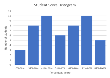
The histogram example below represents student test scores. The student’s scores are classified into several ranges. The height of each bar represents the number of students who achieved a score in that range.

When should a histogram be used?
When data has a single independent variable
When the data is dependent on a single variable, like a customer’s age, a histogram should be used. Histograms help viewers understand the distribution of the dependent variable. For example, the bank balance of customers based on their age.
When data has a continuous range
When the sample data represents a continuous range like test scores of students, a histogram is useful. When data has significant gaps in its range, a histogram may not be suitable.
When two datasets need to be compared
Histograms are an excellent tool for comparing the frequency distribution of two data sets. For example, consider the number of purchases made by customers of different age groups. A histogram can be used to compare this data across multiple stores.
What are the main uses of histograms?
Analyzing frequency distribution
Histograms are particularly helpful to analyze the frequency distribution of sample data. In a statistical experiment, frequency distribution is the number of observations that belong to a particular category (or “bin” in histogram terminology).
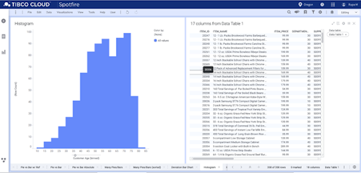
In the example below, the histogram shows the purchases made by customers of different age groups. The histogram clearly shows the range of age-groups compared to purchases. According to the histogram, customers of the age group 50-70 have made the highest number of purchases.

Analyzing the data symmetry
With histograms, viewers can analyze the nature of frequency distributions. Some of the distributions may be symmetric, which means the mean of the distribution is precisely around the mid-value of the data set. Some other distributions may not be symmetric but left or right-skewed. This shows the data’s mean value is around the beginning or at the end of the data range. Some of the data will have a uniform distribution where every bin has almost the same number of data points.
Analyzing change over time
Histograms can analyze how process outcomes change over time. For example, the number of defective items manufactured over a shift in a factory might change over time. An organization can use this data to determine the hours where defects are high and seek preventive measures.
What are the best practices when using a histogram?
Using a zero baseline
While using histograms, the base value must always be zero. As the height of each bar represents the number of samples in a range, using a non-zero base will skew the visualization of a frequency distribution.
Choosing the right number of bins
One major decision while creating the histograms is the number of bins. Usually, tools will have different algorithms to define the number of bins. Too many bins will result in the data distribution looking coarse. The values that are not significant (noise) might also be represented, which makes analysis difficult. If there are too few bins, then the histogram will not have enough details to make an inference from the data. While making histograms, a certain amount of trial-and-error on the bin size is necessary.
Using equal bin sizes
While most histograms have equally-sized bins, it is not a strict requirement. In data sets with sparse data, it might seem convenient to combine a few bins, resulting in unequal bin sizes. This makes the interpretation of histograms difficult. The total area of a histogram represents the whole data, and each bar represents its parts. With equal bin sizes, it is enough to look at the height of the bars to identify the frequency of data points. When the bin sizes become unequal, one needs to look at each bar’s area rather than the height. Usually, it is easier to interpret the height rather than the area, so using equal bin sizes is a good practice for easy interpretation.
When should histograms not be used?
When the data is non-numeric
Histograms are most suited for graphical representation of a numeric variable with a continuous data range. If the data consists of non-numeric values like gender or location, the histogram is clearly a misfit. Pie or bar charts can be used in this case.
When the sample size is small
Histograms work well when there are enough data points in the sample. When there are too few data points, the histogram fails to visualize the distribution of the data. As a rule of thumb, histograms are useful when there are twenty or more observations. When there are fewer data points, it is best to use standard probability plots.
When there are large gaps in the data
Histograms are best suited when the sample data is continuous. Histograms represent data points that belong to different bins, so the graph is inefficient when data is missing or undefined.
What are the applications of histograms?
While pie charts and bar charts are data visualization tools, histograms are predominantly used in statistics. Statisticians use histograms to understand the sample data better. Histograms are often used to explore various statistical properties of the data.
To visualize variability
Assume that there are two data sets with similar mean values. From this information, the data sets seem similar. When we plot these data in histograms, the variability of data becomes apparent. The major data points lie between 40-70 on the left histogram, whereas on the right, they are almost equally distributed between 20-100. Even though the mean is the same, a histogram easily visualizes the data variance.

To identify outliers
In statistics, an outlier is a data point that lies at an abnormal distance from the other data points. Histograms are useful in visualizing these outliers. They appear as an isolated bar. Outliers occur due to the abnormality in data or due to some data entry errors.
To identify multimodal distributions
In statistics, a multimodal distribution is one with multiple peaks. For example, the histogram below has two different peaks. A data set’s multimodal characteristics may not be easily identifiable by calculating the distribution’s mean and variance. A histogram helps to identify such multimodal distributions.
To assess the fit of a probability distribution function
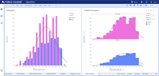
Statisticians often use histograms to assess a probability distribution function’s fit. A histogram is a representation of the actual sample data. A fitted distribution line tries to identify the probability distribution function that can correctly predict the sample data distribution. Statisticians often overlay the probability distribution functions over the histogram to assess their fit.

What are other charts related to histograms?
Bar charts
When the data is non-numeric or discrete, a bar chart is a better fit than histograms. For example, bar charts are useful for plotting purchases made by different customer categories (guest, new user, and existing user) as these categories are discrete and non-numerical. In contrast, histograms are useful when we plot purchases against the customers’ age (continuous and numerical).
Line fit
When there are many data points with minimal deviation, the histogram may not visualize the data’s nature. In this case, a line fit is more suitable to visualize the nature of the data.
Scatter plot
Histogram and line fit are useful when there is only one independent variable. When there are two independent variables, a scatter plot is a better option. In a scatter plot, the X-axis represents one independent variable, and the Y-axis represents the second variable. If there are three independent variables, then a 3D scatter plot can be used.

