What is a waterfall chart?
A waterfall chart is a data visualization technique that shows how an initial value can be affected by the cumulative effect of sequential positive and negative values. This chart can be used to show either sequential or categorical data. It uses a series of bars that show gains and losses, clearly showing how an opening figure was changed by events and led to the closing figure.
It has also been called a flying bricks chart, a bridge chart, and a Mario chart due to its resemblance to bricks suspended in mid-air like the popular computer game. However, it is commonly known as a waterfall chart, despite the fact that water does not flow upwards (and therefore is a misnomer).
The invention of this chart has been attributed to McKinsey & Company, who started using these charts in presentations. It is a modern chart that’s commonly used by financial firms to show financial gains and losses.
How does a waterfall chart work?
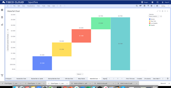
To take a simple example, consider electronic goods sales at branches of a store. Each branch has its total sales on the chart, and together, they add up to the total sales for the entire chain.

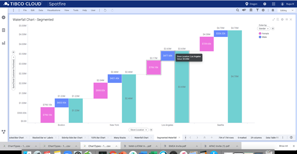
Getting more complex, assume the business needed to know how those sales were divided among males and females. The above chart shows the sales to males and females at each store, adding them together as the chart moves from left to right across the branches.

Typically, though, waterfall charts have negative values on them, too. In the real world, there could be negative amounts, such as returned items and faulty or broken goods that would need to be returned to the manufacturer. In those cases, the chart would have negative values, too.
Best practices for waterfall charts
Full columns first and last
The totals at both the starting point on the left and the finishing total on the right should be full bars. The bars in the middle are the floating Mario-style blocks.
Horizontal lines
The very nature of waterfall charts is that the data is connected in some way. Having horizontal lines connecting the bars does two things: it shows the interconnectedness of the figures and helps viewers see the changes in a spatial manner.
Colors
The use of color in graphs is very important, not only for ease of understanding but also for avoiding confusion. There are two schools of thought for waterfall charts. One is that negative figures should be one color and positives another. The second is that the colors are chosen for some other reason, maybe to indicate other factors. Whatever happens, the color should be an explicit decision, making the meaning of the numbers clearer and easier to understand and not misleading.
Labelling
As with all charts, waterfall charts need to be easily understood and not misleading. Labels and headings should be used to avoid confusion.
Scales may not start at zero
Unlike other charts, there is no need to start the scale at zero. While the scale must be even and not misleading, it is unlikely that 120 staff were hired in January. While the initial number of staff was 120, if only 20 were hired, then the scale starting point requires the use of alternative colors to make it clear that this data represents a total.
When to use waterfall charts
Waterfall charts are useful when a viewer needs to visualize negative and positive growth. A waterfall chart should be used in any scenario where the overall changes need to be seen. In a business context, think about the following scenarios:
In human resources, a waterfall chart can show the staff numbers at the start of the year, the hires, any transfers in or out, resignations and exits, and then the ending staffing count.
With share and stock prices, the waterfall chart can be used to show gains and losses over a period of time. While there are plenty of charts specifically designed for this task, a waterfall chart is a simple chart that shows a price journey over time.
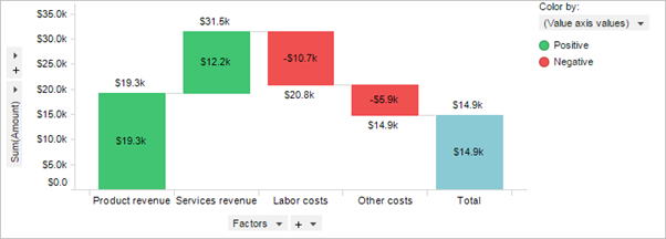
An organization’s profit and loss can be interpreted in a waterfall graph. The below chart shows the income from product sales and services revenues, then negatives in the form of cost of goods sold and expenses, with an end total of the net profit.

A waterfall chart should be used when:
- There is a need to graphically display change from a starting to a final value
- The data has positive and negative values
- The data can be categorical, such as revenue and expense types, or it can show movement of a variable over time, such as share price
- You need to audit the changes that have contributed to a final total
Benefits of waterfall charts
Shows changes
The whole purpose of a waterfall chart is to show the changes to something over time. It is very effective at performing this task.
Simple to understand
In the Western world, people read from left to right, and waterfall charts utilize this fact to show start and end values in a logical fashion. The first bar also is a great visual starting point, giving the viewer a comparison anchor from the first glance.
Gives micro stories
A waterfall chart tells a story that is generally far more compelling than a simple group of figures.
Disadvantages of waterfall charts
Hard to compare without a baseline
Without a common baseline, it can be difficult to compare the individual segments. Even with labelling, it can be tricky for a viewer to see the true differences between the bars.
Solution
This chart is designed to show changes over time. While adding data labels to the bars can make the chart easier to understand, it would be more effective to use a bar graph.
Not commonly known
For most people, the waterfall chart is not as well known as other chart types. At first glance, the chart can be misleading because it looks like a bar chart with gaps. This can lead to confusion.
Solution
There must be training or an explanation given to people who need to fully understand the waterfall chart.
Alternatives to a waterfall chart
Cascade chart
Similar to waterfall charts, a cascade chart shows intermediate sums along the way. So, as well as having a full bar on the left and right sides of the chart, there might be total solid bars in the middle. This chart is an excellent option where there is a lot of data to present, and there is value in showing the intermediate totals. For instance, all the sources of income add up to gross profit, which might be best displayed with a solid bar.
Bar or column chart
If in doubt, use a bar chart. It is the classic way to present an array of different information because it offers a simple and immediately understood way of displaying data. It can still display positives and negatives, but it offers fewer comparison capabilities than a waterfall chart.
Future of waterfall charts
Used correctly, waterfall charts are an excellent way to display changes to data. Whether it’s categorical or dated, this chart clearly shows how a finishing point was reached. Used often, especially by financial firms, waterfall charts are a sleek and effective way of communicating information.

