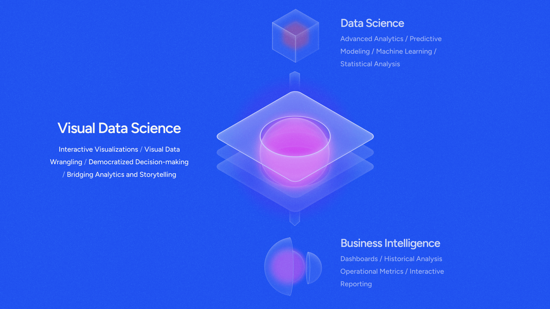
What is visual data science?
Visual data science is the convergence of statistical and specialist tools to empower domain experts with a visual-first approach to data science. It goes beyond the traditional dashboard reporting of business intelligence (BI) tools while handling complex data sets and workflows like a statistical data science tool (DSML) in a visual-friendly interface. Visual data science empowers users in less technical roles to utilize the powerful benefits of advanced analytics and artificial intelligence (AI).
A comprehensive overview of visual data science for data-driven professionals
Visual data science uses interactive tools to analyze, interpret, and communicate data-driven insights effectively. It combines principles from data science, information visualization, and user interface design to make complex data more understandable and actionable. Visual data science helps bridge the gap between raw data and human decision-making by leveraging the power of visualization to uncover patterns, trends, and outliers.
Visual data science empowers people to make better data-driven decisions—and to do it faster. With powerful data science platforms, teams can prepare, explore, and visually analyze data at scale, at rest, or in motion across multiple sources. Visual data science plays a vital role in bridging the gap between data-driven insights and decisions.
Key components of visual data science
Visual data science incorporates several key components, starting with visual analytics tools and interactive dashboards. These elements serve up powerful displays that allow users to dynamically interact with data. The result is a deeper level of engagement and understanding, as users can explore data, ask questions, and see the answers in an intuitive format. Interactive dashboards bring together multiple visual elements to provide a rich array of information in a single location.
Visual data science also requires a set of foundational tools for data wrangling and integration with source systems. Raw data must be cleaned, transformed, and organized into a usable format for analysis and visualization. Real-world data is often messy, incomplete, and inconsistent, making it unsuitable for immediate use in analytics or machine learning models. This is especially true in cases involving multiple disparate data sources. Data wrangling tools offer a means of efficiently bringing together all the elements necessary to create an effective data visualization.
Finally, predictive and streaming analytics help organizations make data-driven decisions in real time and anticipate future trends. Predictive tools are built on machine learning algorithms that discover correlations and forecast future events based on past history. Streaming analytics are especially valuable for use cases in which immediate action is critical, such as financial fraud detection, law enforcement, and healthcare.
How is visual data science different from traditional tools?
Visual data science is different from traditional analytics and reporting platforms due to its data-intensive and robust capabilities. It’s more immersive and user-friendly than niche, specialist tools as well.
Business intelligence (BI) offerings
Business intelligence tools are great for quick insights and downloadable reports. They easily transfer knowledge across an organization. However, most BI tools cannot handle the large data sets in complex industries like pharmaceutical manufacturing, oil and gas upstream activities, or semiconductor manufacturing.
While these tools are easy for all business users to get started with, they are limited on their statistical machine learning and AI capabilities. They feature immersive, storytelling visuals, but lack the depth of capabilities needed to power data-intensive use cases like anomaly detection, predictive maintenance, advanced geolocation, and others.
You can show the team clean visuals and graphs, but if you’re in energy, manufacturing, or life sciences, you probably have to use additional tools to perform advanced AI and ML.
Data science and machine learning (DSML) offerings
Many DSML tools are highly specialized for niche industries, offering unique advantages for tech-savvy statisticians and data scientists. However, one company may require several specialist tools for different departments or job functions, leading to higher costs and information siloes. DSML tools are advanced, quite costly, and cannot easily be learned by traditional business users or even domain experts like engineers and scientists without extensive training.
Usually, a select group of individuals at a company has access to the wealth of insights within a DSML tool that may—or may not—make its way to those making critical decisions on the factory floor or boardroom.
The visual data science difference
What if there was a way to combine the immersive, interactive visuals that business users love with the power and strategy behind a DSML tool? That’s where visual data science comes in.
Visual data science is an advanced solution that offers data wrangling, visualization, modeling, and predictive insights in a platform that can be shared collaboratively across the enterprise. Data doesn’t have to stay siloed in multiple analysis tools, and data scientists don’t have to spend all their time cleaning and sorting through data. They can get back to their analysis, and your decision makers can easily find all the insights they need, with one click.
No more reports that take hours to days to refresh, load, or filter. No more waiting around for the statisticians to send over ad hoc reports. No more crashing data sets and data source limitations.
This is the power of visual data science.
Use cases across industries
Visual data science has applications in virtually every industry, from manufacturing to healthcare, energy, and life sciences. Here are just a few examples of how visual data science is having a positive impact:
Manufacturing
When STMicroelectronics wanted to empower its production teams to solve manufacturing problems quickly and accurately, the company rolled out Spotfire to its front-line people, giving them powerful interactive dashboards that offered immediate information in a highly intuitive format. Manufacturing teams at STMicroelectronics are making better decisions, spotting production problems quickly, and addressing issues faster than before.
Energy
Enertel, an energy solutions provider, rolled out Spotfire visual data science tools to enable smarter energy decisions. By analyzing consumption patterns and operational performance, Enertel optimized its investments in exploration and drilling, as well as enhanced decision-making processes.
Healthcare
Hospital Universitario Lucus Augusti (HULA) deployed Spotfire to analyze patient data, which led to better clinical decisions and improved patient outcomes. The platform's visualization tools enabled healthcare professionals to identify trends and patterns critical for patient care. Spotfire is also helping the hospital lower the cost of treatment. When diagnosed in its early stages, for example, cancer is often five times less expensive than when treatment begins in the later stages. Early detection can lead to savings in the tens of thousands of Euros.
Benefits of visual data science
Visual data science makes data analysis more intuitive, accessible, and actionable. It democratizes data by making insights comprehensible to a wider audience, including non-technical stakeholders. By simplifying complex data visualizations, tools like Spotfire help people quickly and easily make sense of multidimensional relationships. Intuitive interfaces and interactivity keep users invested in the analysis process, improving engagement.
Visual data science improves collaboration as well. Interactive dashboards enable teams from diverse backgrounds to engage directly with data, without requiring specialized technical knowledge. Live visualizations and real-time what-if analysis tools enable open discussion and sharing of insights on the spot. Teams can collectively explore different scenarios and predict their potential outcomes. That creates an environment in which highly effective team-based problem-solving can occur.
Visual data science also leads to faster decisions by offering immediate insights into trends, patterns, and anomalies, without requiring extensive manual analysis. This is especially true when visualization tools are paired with streaming data to support highly time-sensitive decisions in industries like finance or manufacturing.
Interested in learning more about visual data science or leveraging it for your organization? Learn more today about the only true visual data science platform.
Related resources
Learn about how Spotfire combines industry-specific visualizations with cutting-edge solutions to solve your most complex problems.
Hear from Spotfire leadership about visual data science, a reimagined look at business intelligence fueled by predictive capabilities and real-time data.